Month: February 2021
Saxon Apartments
For Saxon Apartments, Dominvs Group wanted to focus on the connectivity and location offering a rich and varied lifestyle to young professionals – close to central London yet with a strong sense of community and amenities – as well as the quality and specification of the development, accompanied with high quality CGIs.
“Graphicks were fast and responsive in delivering eye-catching creative to make Saxon Apartments shine”.
Charles Leigh, Development Manager, Dominvs Group
Elizabeth Street
Grosvenor Estate’s enchanting Elizabeth Street is an established fashion community that we wanted to bring home to potential new occupiers with Colliers and Bruce Gillingham Pollard. Aimed directly at fashion brand founders, we took our cues from fashion magazines with editorial layouts, bold headlines and high-end photography to ‘Banish The Boring’.
10 Parkway
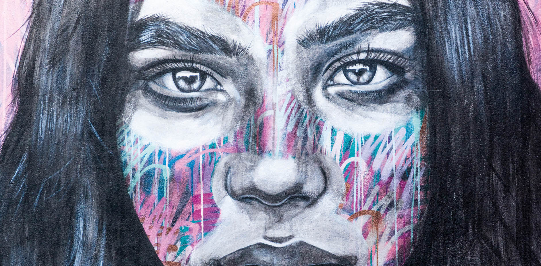
London & Regional wanted to go against the grain of traditional property marketing and be led instead by the artistic heart of this culturally iconic neighbourhood. Original canvases were created by graffiti artists for the reception area, providing colourful artwork for the website and brochure that led to a successful launch and full letting of the offices by Edward Charles.
360 Bristol
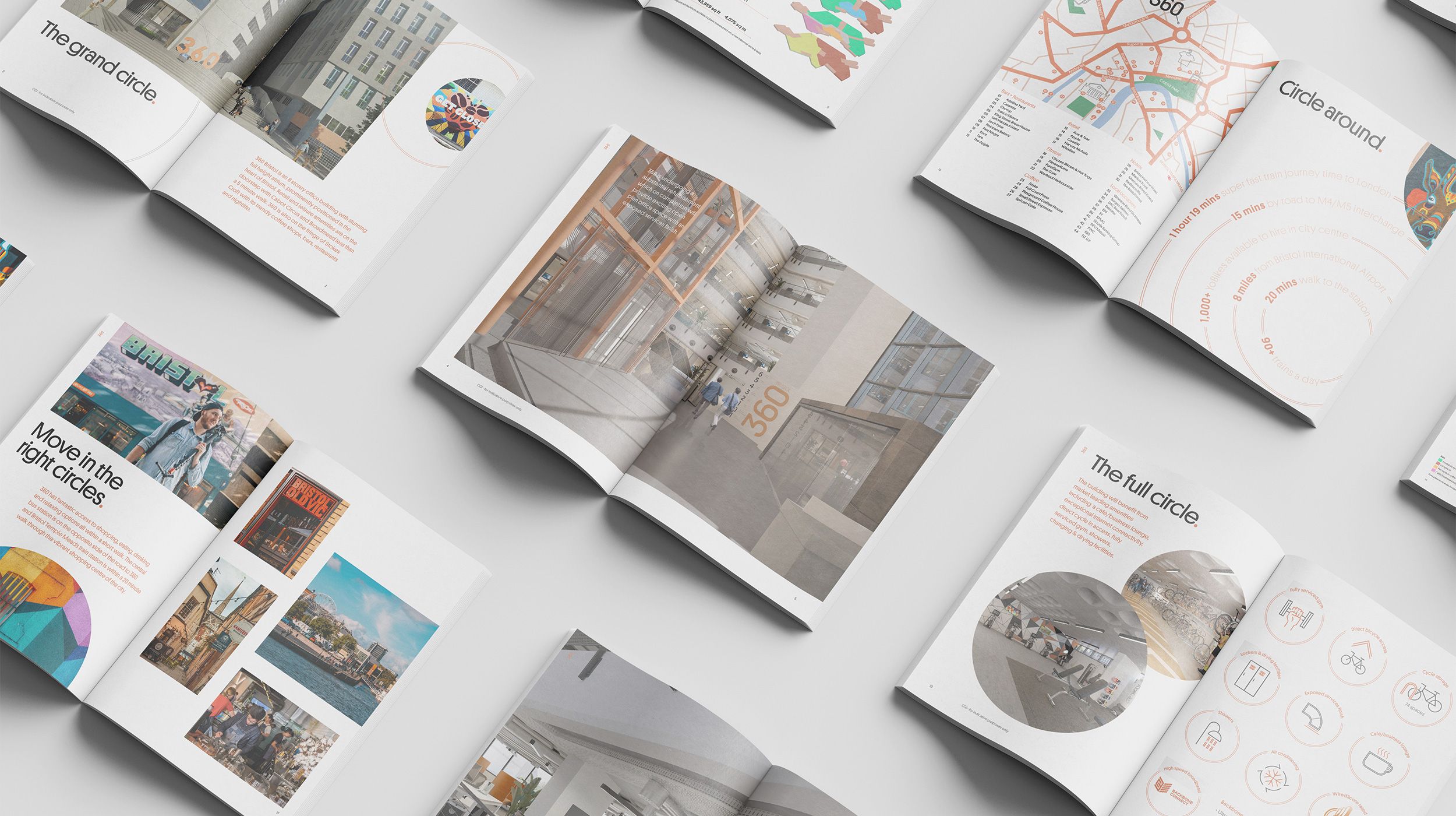
Melburg and Angelo Gordon teamed up to acquire the 100,000 sq ft South Plaza building in Bristol city centre. Together with Knight Frank, they came to us looking for a dynamic and distinctive brand and marketing campaign for the newly refurbished workplace building complete with gym and café. We took our design cues from the building’s unusual shape and its 360-degree views across the city to change the perception of the building. 360 Bristol is in demand and on track for a bright future.
20 Old Bailey
Metro Bank and Colliers approached us for a stylish brand and marketing campaign to launch this contemporary workspace building. With in-person viewing on hold, we devised a digital-only approach focused on interactivity with film at the heart of it. We created a walkthrough video of the building and local attractions to showcase the offer and shared it far and wide. The campaign attracted a great deal of interest and was positively received.
Shelley Sandzer
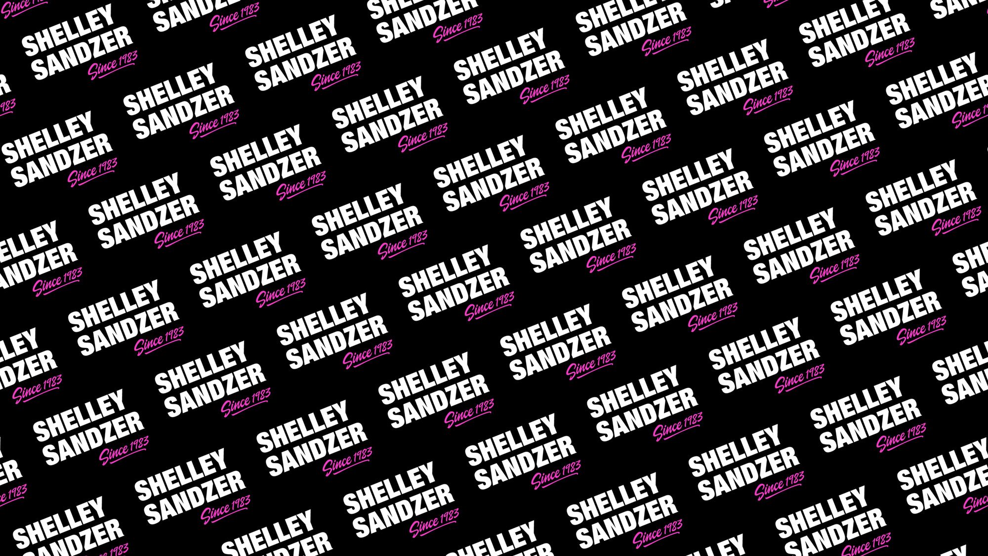
We love a brave client, and Shelley Sandzer is just that. The award-winning leisure property consultancy came to us with a clear brief: make us stand out from the competition. We took them at their word. We collaborated closely with the team and their communications agency to craft a brand that truly resonates with their clients. The result makes a statement – neon pink and black with eye-catching typography features across their marketing collateral, merchandise and website.
